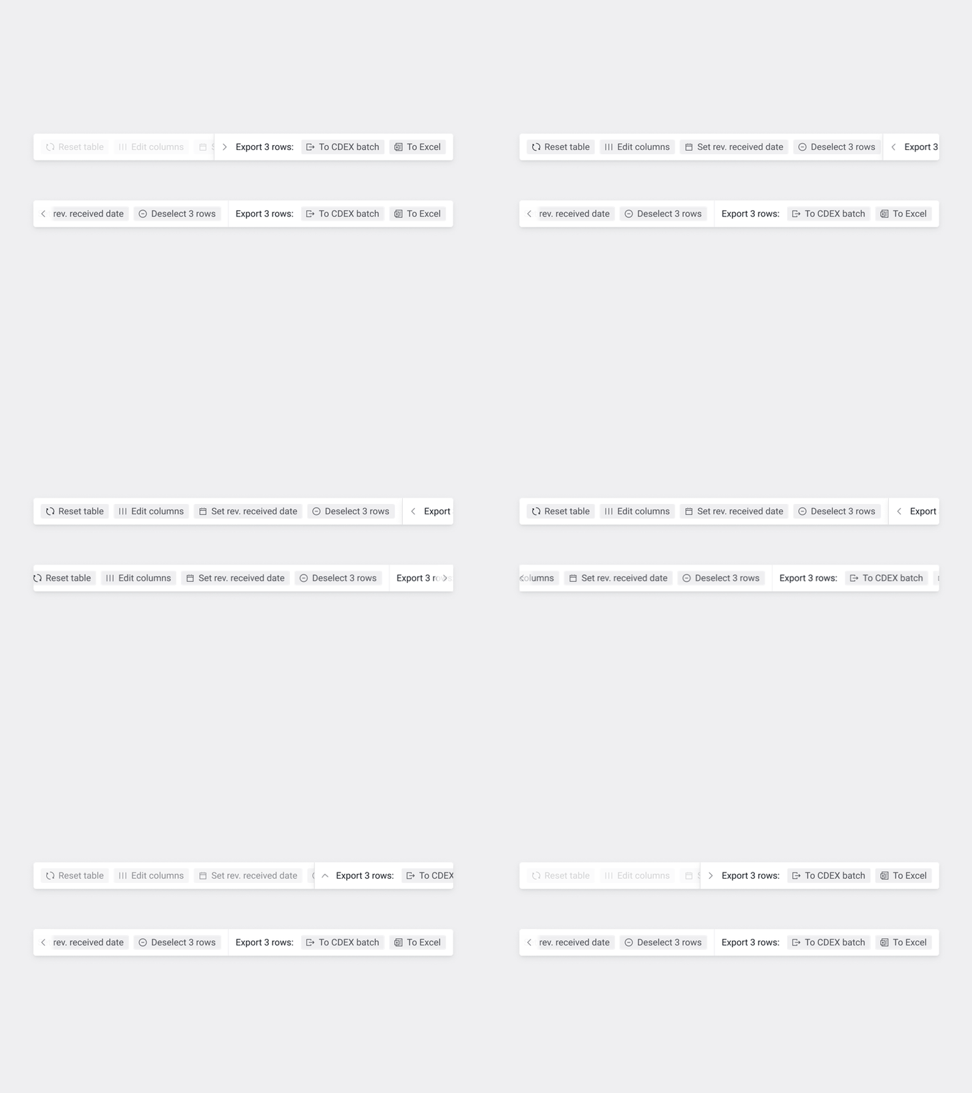
Table Options
We're having an issue on some tables with an abundance of possible actions. There's a little "action bar" at the top of each table, paired with search that gets super crowded, really quickly. These were some explorations into ways to deal with that.
Some challenges with this:
1. We want export options to be quickly accessible, and preferably on the right, to maximize visibility. These are probably one of the more likely things to be clicked.
2. Actions should be easy to find, and with a similar color, icons get really important for fast recognition, so no saving space by killing those.
3. One "move" with the buttons is probably going to be enough, although more than one page of actions may exist. I chose to ignore that though—if that's an issue, there's likely other problems to address.
There's also another option attached, that I think I like the most—compressing the search input to give the action bar a little more space.


