Healthcare Consulting Website
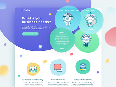
Here’s our first shot for the re-design of a Healthcare Consulting Website.
Our Client prioritizes strong and approachable relationships with their public. So, our newest design was thought out and executed to have a friendlier tone.
With this visual stance and the cute but professional mascot added to the mix, our client ends up having a distinctive web presence when compared to the competition.
We discovered that the target group didn’t have the habit of scrolling to find all the information they sought. This fact alone had us rethink on how to best display the multiple company services above the fold.
Thanks for watching!
Don’t forget to show your love, hit “L” and follow us!
More by Hapibot Studio View profile
Like

