About this app page
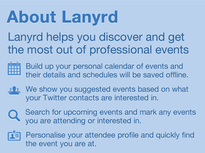
The top part of the new about page for the app, I took what we are saying in the old about page (attached) and separated it out into more easy to read chunks. I am not 100% happy with this, something feels a little off with the spacing at the top or perhaps it just feels a little flat. I have aligned everything to an 4px (non-retina) grid.
If you look at the attachments you can see what I have done with the rest of the about page (this will scroll)
More by Natalie Downe View profile
Like


