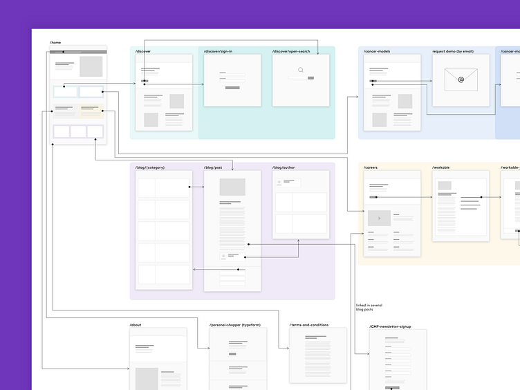
Repositive.io - Site map
At Repositive, we're taking stock of what we've built so far to help us prioritise what comes next.
This is the current state of our corporate site. It was re-skinned after Repositive rebranded earlier this year. But content- & structure-wise, it's not reflecting what we need it to. And there's lots of stakeholders with a keen interest in how we improve it.
I put together this site map to give a full picture of what we have and help us discuss ideas in a more systematic way.
I designed it in Sketch. The various elements are split up into symbols, saved in Abstract in a Sketch library and shared with the design team. This will help us create site maps quickly and consistently which will be handy, not just for understanding what we have, but also for developing and communicating ideas we have for future iterations.
