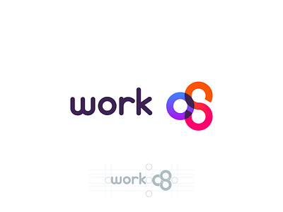
Work Os logo
Logo for integrated work management software - the shape forming the letters "OS", while symbolizing the 3 core overlapping parts of the product.
The shape with circles resembles the aggregate fruit shape of cloudberry/raspberry/mulberry - so the colors are inspired by them and amplify the feeling of freshness.
More by Veli-Johan Veromann View profile
Like
