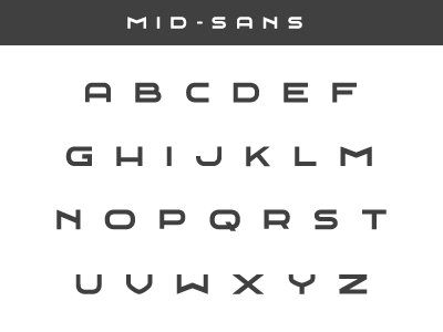
Mid-Sans 1st Draft
After working out a handfull of letters for the Midwestern Identity I spent a bit of time this past weekend building out a rough draft for the the rest of the alphabet. It's the first font i've ever designed... learned a ton, and still learning. Letter forms ain't easy...
The font is an extended sans -serif that is heavily influenced by mid-century modern style architecture (specifically Richard Neutra's work). Although not intentional from the get go, the N actually has an outline similar to a mid-mod style house.
Definitely a work in progress at this point still and it will need some tweaks here and there. I would LOVE any feedback you might have.
Here's a larger version: http://cl.ly/GFON
More by Matt Spiel View profile
Like
