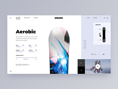
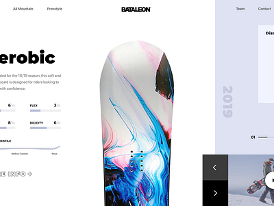
Promo Website for a New Line of Snowboards
Hello there!
I’ve got some good news to share: I’ve just become a part of @Zajno Crew team! I’m pretty excited I did and I’m sure we have lots of interesting projects and adventures ahead of us!
In the meanwhile I’d like to share my first shot I created here at Zajno. I’ve experimented on how a promo website for a new Bataleon snowboards line might look like. What you see above is the main screen of the Jib/Park page where users can find and check out all the boards in this category.
Goals
Designing a website to promote the company’s new product line in such a way that it appealed to the target audience and adhered to the brand’s aesthetics.
Approach
As the company’s style tends to minimalism, we chose to use Scandinavian style while designing this website. We put all the key information such as board characteristics and video review on the main screen so that users could easily find it. The idea was also to experiment a bit with the composition and come up with some unusual, fresh solutions. To that end, we played with the geometry of the layout and applied golden canon grid which helped us achieve the goal.
Results
You can see above what we ended up with. I’d like to think that it looks pretty clean and gets the job done. But I’d like to know what you think of that! Share your feedback! :)
Press "L" to show some love!


