Huzzah 3-Screen Design
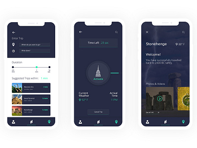
Screen 1-
Explored 2 different use cases and user behaviors
- Users who are familiar -enter a specific time and location
- Users who are unsure, there are suggestions that shown below.
This combats 2 separate use cases.
The slider feature will determine the length a user would like to travel.
Screen 2-
Creating an easy-to-navigate interface.
Having the UI speak volume to to the brands overall message of being - Safe, Stable, Reliable.
Screen3-
Once landed back in time, it’s important to let the user know that they have made it safe.
The decision was to divide the screen into 3 sections creating a visual hierarchy showing:
o Location of desired travel & current weather
o A welcome message letting the user know they have successfully travelled to their location
o Curated gallery with horizontal scrolling feature. This was designed for users to discover options while at their destination
o This feature allows the users to gauge a better understanding of the current location that they traveled to and explore options they may not have known before.