TROC home page

The good thing about working with a company from its launch is that you get to see it grow and evolve, and the best part, you get to be part of all that. With that much growth and in so little time the design of the site and it's collaterals had to change quite a few because with time we got to know our clients better and also what worked and what didn't for the industry.
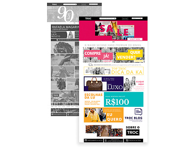
We decided to invest in a more flat and modern design, using mainly san serif fonts in different weights, paired with bold prints and a bright color pallet. Since the site has a vast product selection and various campaign outlets the pallet had to have a lot of variations, so the communication wouldn't get boring for the client.