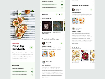
ZX Explorations - Recipe App UI Concept
The weekly exploration is in. Decided to go to app UI concept since I haven't uploaded one in about year.
The theme choice was really easy because I found those amazing photos in Unsplash. 😅
In terms of build - Decided to add 'checklist' in the ingredients so you can better remove the ingredients that you already have/bought.
Also added a section 'How to' section, the idea for which is to have short videos on the steps which you can also check to see what's left.
What do you think?
--
Whats the idea behind the weekly moodboards?
The moodboard contains of images, fonts and colours which are later translated in a design. The idea is to challenge yourself to test new styles to create and test something new in terms of style grid or w/e you feel like doing with it. It doesn’t necessary need to be UI, it could be a print or something you feel might be looking cool.
DM me if you want to get the resources and/or participate.
--
Want to see some backroom shots & to follow me on my journey? Follow me on my Instagram
.
