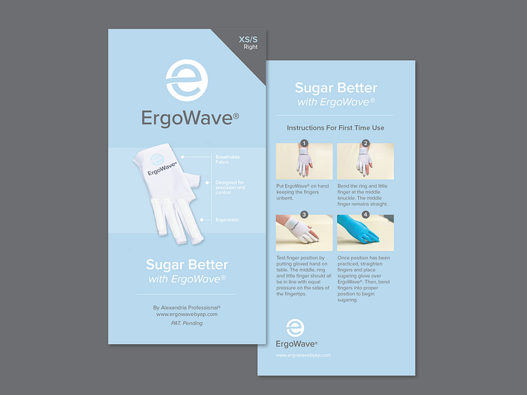
ErgoWave® Glove Packaging
Our goal with this branding project was to make a visual connection to Alexandria Professional® while creating room for the ErgoWave® glove to stand out on it’s own. Our solution uses the blue circle from the main logo, and an “e” with a nod to an ergonomic wave to tie it all together.
The “e” stands boldly as a visual representation of the new ErgoWave® glove, and because it was designed with a tie to the parent logo in mind, it paves the way for a consistent set of visuals for any future professional tools by AP.
For the full project, visit: http://www.crescendodesignstudio.com/ergowave/
More by Kristen Matteo View profile
Like
