carmen - logo sketch
Hello guys!
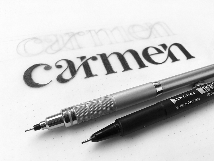
I'm working on a new identity for a make-up artist called Carmen. This is a rough sketch of my early lettering explorations.
The story is: After some symbol variations, I decided that using a serif wordmark create a much stronger and genuine impact in terms of brand identity. So I started to experience!
The main idea is to express a fluid and continuous mood like those makeup thin lines which help to highlight facial features. For this result, I chose to link the letters "a" and "r" also "e" and "n" through a curved ligature.
I enjoy this approach because it was a chance to learn about serif font characteristics and many other typography pieces of information.
Have a creative day!