Lifecycle view: Desktop #1
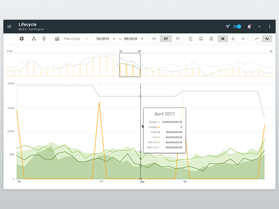
This shot is a part of a series of designs for a flexible multi-year data visualization view which is a part of a large enterprise project-management web application.
For more context about this view, you can also check-out these related screens here on Dribbble:
* Initial mobile set (single selection mode)
* Item selection mode (desktop)
* Switching selection-modes on mobile
The top visualization area shows financial data for the entire span of the WBS (which is like a project). It contains a "data slider" which allows the user to select an area to be "magnified" in the second (lower) visualization area.
Below app-bar (which contains the hamburger icon), a "view settings bar" offers several controls for things like:
(a) Setting the start and end dates of the "selected area" (the user can also use draggable handles in the "data slider", but these controls offer greater specificity to their selection.
(b) 1-year / 3-year / 7-year preset span selectors
(c) An "insights" icon (light bulb) which brings-up a bottom-sheet showing KPI-like information for the selected period of data
(d) Month (M) / Quarter (Q) / Year (Y) data-granularity options
(e) Cumulative vs "incremental" style data (the 2 icons on the far-right). The cumulative option would show the month-by-month data adding-up across the entire span. "Incremental" mode shows each month's data "from zero".
(f) Other icons/features to be elaborated on in future shots.