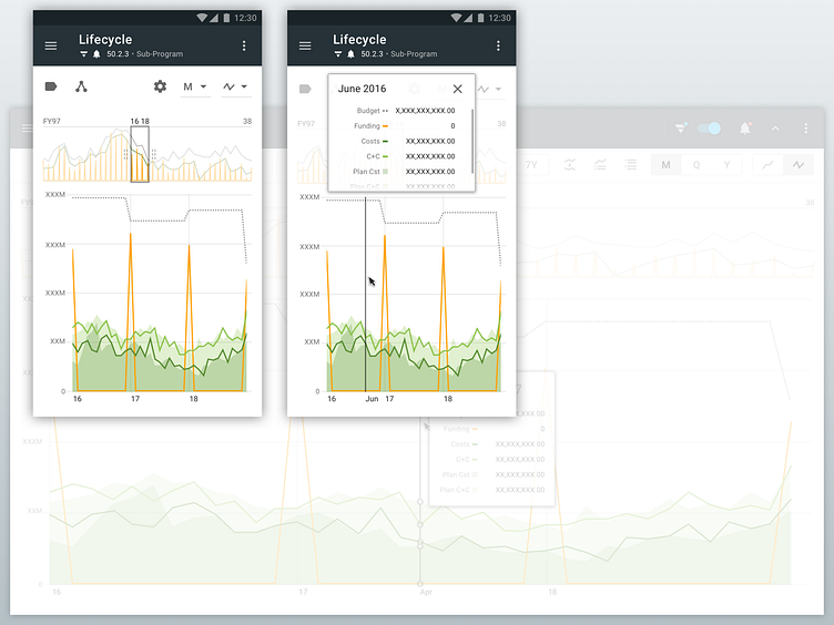
Lifecycle view: Mobile over desktop
This shot is a part of a series of designs for a flexible multi-year data visualization view which is a part of a large enterprise project-management web application.
For more context about this view, you can also check-out these related screens here on Dribbble: * Initial desktop screen * Item selection mode (desktop) * Switching selection-modes on mobile
The top visualization area shows financial data for the entire span of the WBS (which is like a project). It contains a "data slider" which allows the user to select an area to be "magnified" in the second (lower) visualization area.
In this shot, I've placed the desktop version underneath so you can get a feel for the layout and interaction differences on that form factor. I'll also post the desktop version separately.
One of the challenges of the mobile version was to figure out where to place the detail overlay (which shows the numbers) since there was no room for it over the bottom visualization area (like there is on desktop).
I ended up drawing inspiration from websites which have a video playing at the top of the page, but then that video changes to cover a sidebar (or other area) once the user scrolls down the page. In the same way, this design places the detail overlay on top of other controls which are not needed at the time when the user is interrogating the main data.
