Drop Down Menu
In Today's websites we see these drop downs menu a lot but every time i see it i feel there is unnecessary a long rectangle
so i try to solve it..
Case A
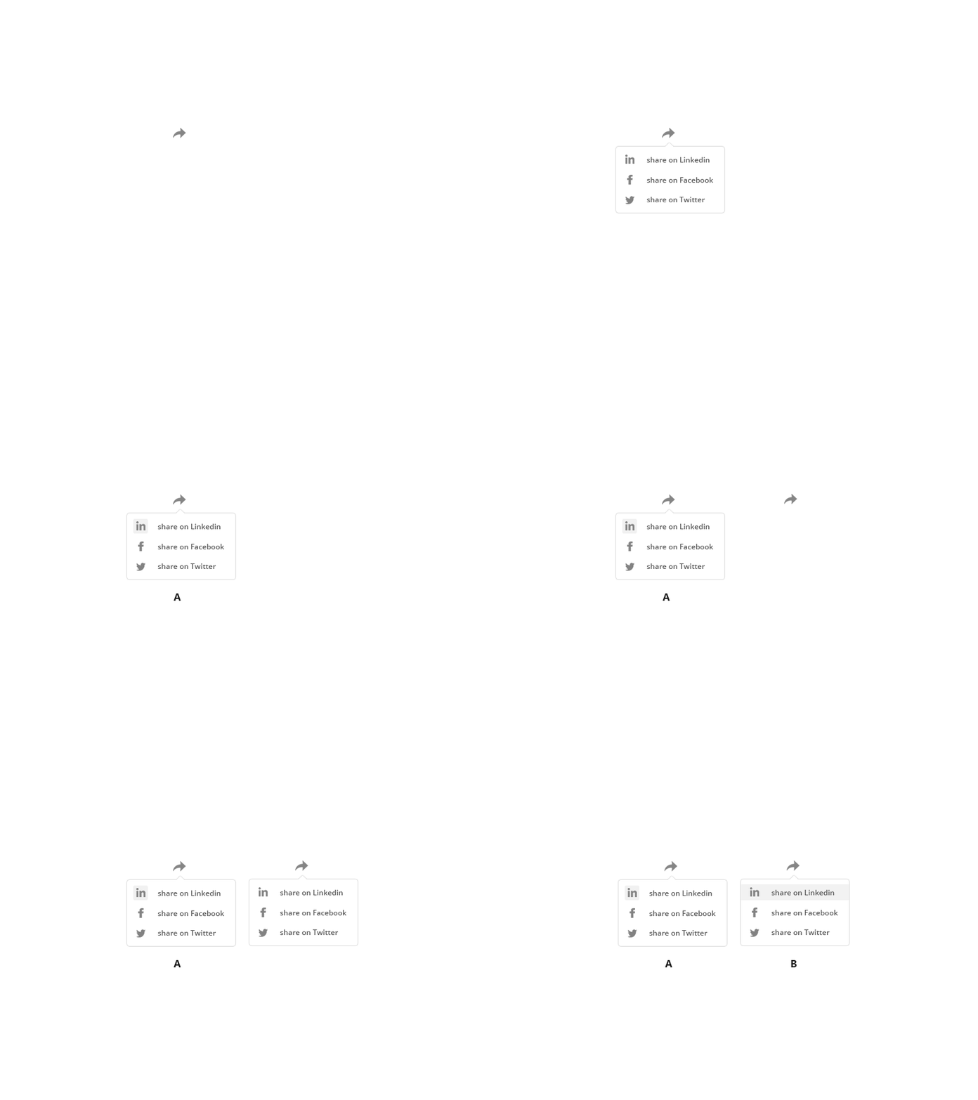
Its My version where i highlighted the icons of the respective platforms. When mouse goes over the text or icons, icons will be highlighted.
Case B
In this scenario when user hover over the share icon it has a shape that is different from the selected shape and also there is a negative space created between the shape and box.
Feel free to Comment which one you like the most :))
More by Keshav Kishore View profile
Like
