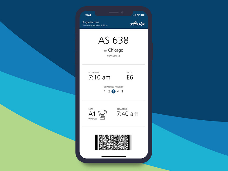
Daily UI 024: Boarding Pass
I'm pretty sure every designer has complained or thought about boarding passes and how much better they could be. I'm certainly no exception.
So this challenge was pretty fun. Because these are *UI* challenges, I went with a digital boarding pass. I focused on key info that one needs when boarding a plane and left anything else out. I'm not saying it's the best. There are many like it, but this one is mine. 😜
More by Angie Herrera View profile
Like
