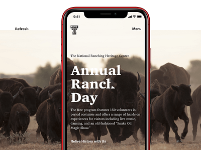
National Ranching Heritage Center Small Context Web
As part of a refresh of the National Ranching Heritage Center, the photography captures the dynamic nature of a profession with ancient roots. Not all ranchers are inconsiderate of the animals they steward; some ranchers deeply care about the creatures they tend and are on the front-lines of protecting endangered species.
The typography and lettermark of the brand refresh interacts with nature in the photography to reflect the direct engagement of ranchers with their livestock. Rather than a brand that fences type from imagery, the brand engages the animals and reinforces the strength and dignity of livestock and represents the courage and danger of ranching.
Carrying the visual DNA of the Double-T, layout proportions harmonize the major 6th (3:5) and minor 3rd (5:6) intervals. The harmonious call-and-response of proportions echoes the harmonious relationship of caring ranchers with precious wildlife.
Check the project out on Bēhance!

