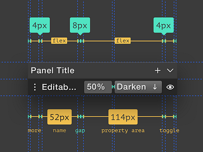
Phase – Design System
{Dark || Light} ?
Hey Dribbblers,
Today we want to share just a tiny bit of our design system. Creating design systems for any product can be really tough – one early mistake can cost you lot's of time (money).
We want to make Phase app as flexible as it's possible and this requires a solid design system for all of the components within the app. It's not only about having the ability to switch between dark or light UI. You need a lot of logic underneath every size, spacing or typeface choice to make it fully flexible.
This is one of our simple component for layer panel.
What's your biggest challenge while creating design systems?
More by Phase View profile
Like


