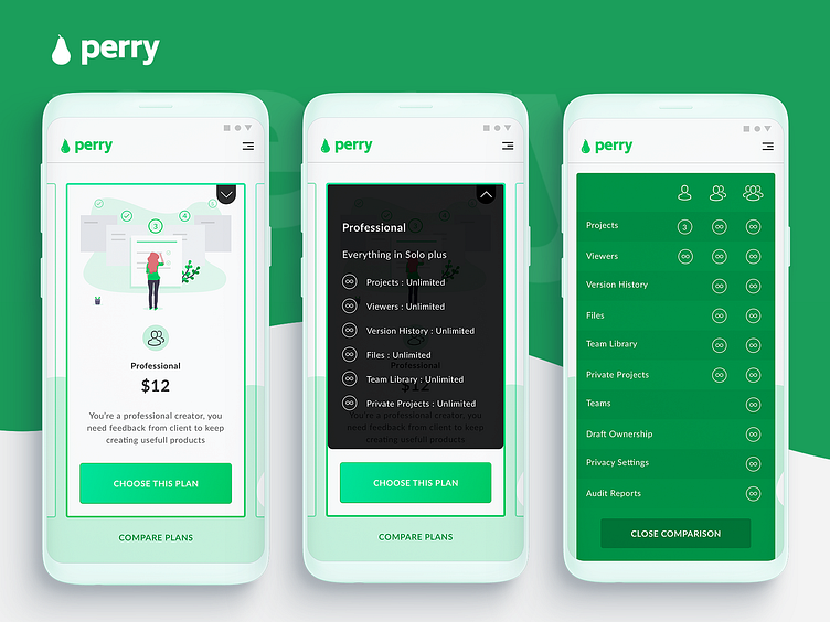
Perry App Concept : Choose your plan
PERRY is a concept that I made while thinking of a way to improve the "Pricing Plans" on mobile sites.
Antoine Dautry (a Developer and friend) wanted tips to improve in UX-UI, so I offered him my weekly challenge: detect a problem in any experience, propose a solution in 2 hours. During a video call, I have: - Changed description of offers to focus on user needs instead of quoting features - Used a dropdown to show features of the plan currently displayed on the screen, - ...
What do you think ? Something you would have done differently ?
Press "L" to show some ❤ ✌🏾 See you soon ! 😉
GET IN TOUCH : LINKEDIN : https://www.linkedin.com/in/colbysdovi/ ⎜ INSTAGRAM : https://www.instagram.com/colbys.design/?hl=fr
More by Colbys View profile
Like
