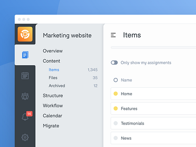
Left Nav Concept
Today we had a make-day, which meant the product team downed tools to design and make whatever we wanted, either collectively or individually. We started the morning agreeing which ideas we'd concentrate on, then got to work.
The rest of the team decided to create something cool with Trello, whilst I got to work on designing a conceptual overhaul of our products' navigation. I was curious to see how a left-hand menu would affect our app. Users of Intercom will no doubt see similarities - it was a major inspiration.
It also gave me an opportunity to play around with our UI font. The font used here is F37 Bolton.
This was a days work, with no doubt room for improvement, but it certainly gives our product a dramatically different look!
More by GatherContent View profile
Like

