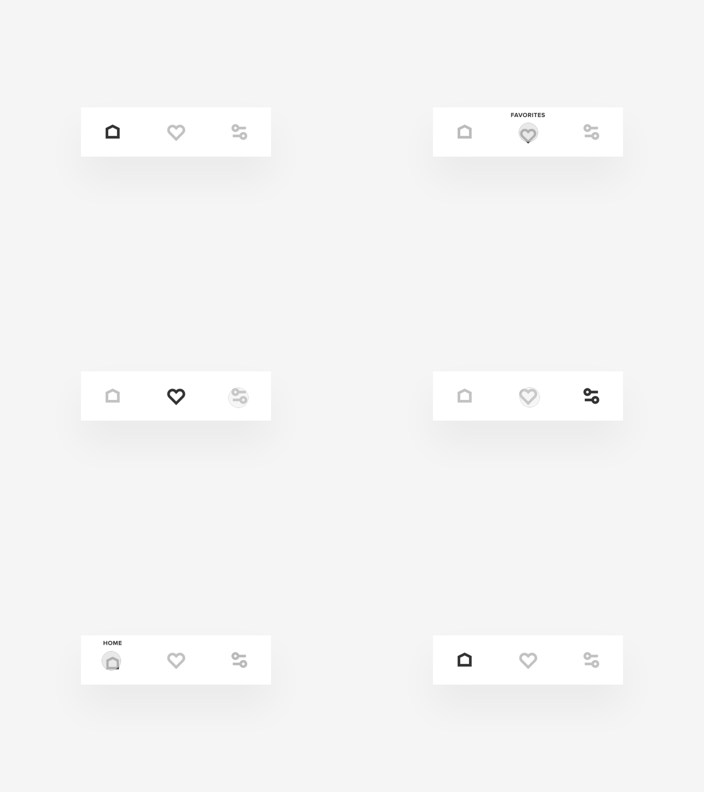
Tab Bar Interaction IX
👋👋👋
Sometimes icons we use for tab bar navigation are not obvious. For different reasons. They might be too much abstract (the better make them less abstract in the case), or we don’t have a common convention for them yet.
Sure, there is a pretty straightforward way to explain to a user what the icon means just put a descriptive label beneath the icon like a default iOS tab bar does. But I tried to explore another approach to that. The concept allows you to keep an initial simplicity of visual design and explanative possibilities of text labels. A user sees a label while they press on a button and interact with that. A user can control a label appearance by holding a button pressed as long as they want.
I attached a source of the concept to the shot, so you can download and test this. I’d love to hear what you think about it.

