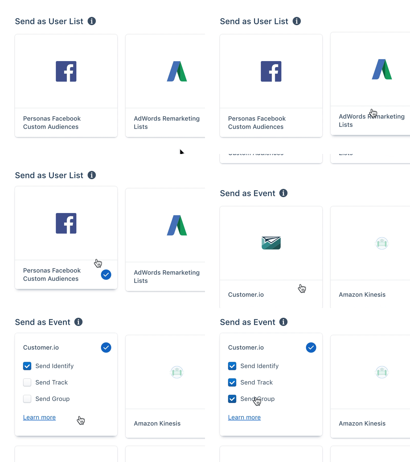
Destination Catalog Redesign
When we set out to redesign destinations catalog when setting up a new audience or computed trait in Personas, we faced multiple challenges.
Each destination in the catalog may or may not have settings and all of them have different settings as well. We didn't want to introduce the "next step" to configure these or add a side sheet when you click on it. Ideally we wanted a UI that would keep user in the catalog, yet allow them to customize each destination.
Instead, our team came up with an elegant solution of settings sliding out from the bottom of each destination card. If you want to unselect that destination, you can click on the check icon again and settings will slide back down. Since there's very little space there, we couldn't insert description for each of the settings, but there's a link to documentation, if user wants to know more.
And oh, did you notice the cute check icon animation? This is my favorite part here.
