Credit Card Checkout / DailyUI 002
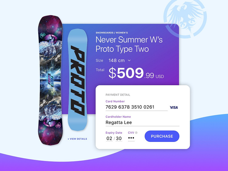
Trying out a simpler look than yesterday. Played around with gradients and a simpler checkout form that replicates the look of a credit card for better usability.
Thoughts anyone?
PS: Love this particular board and the company that manufactures it. This board is definitely in my wishlist this year. Check out neversummer.com for more info about them.
