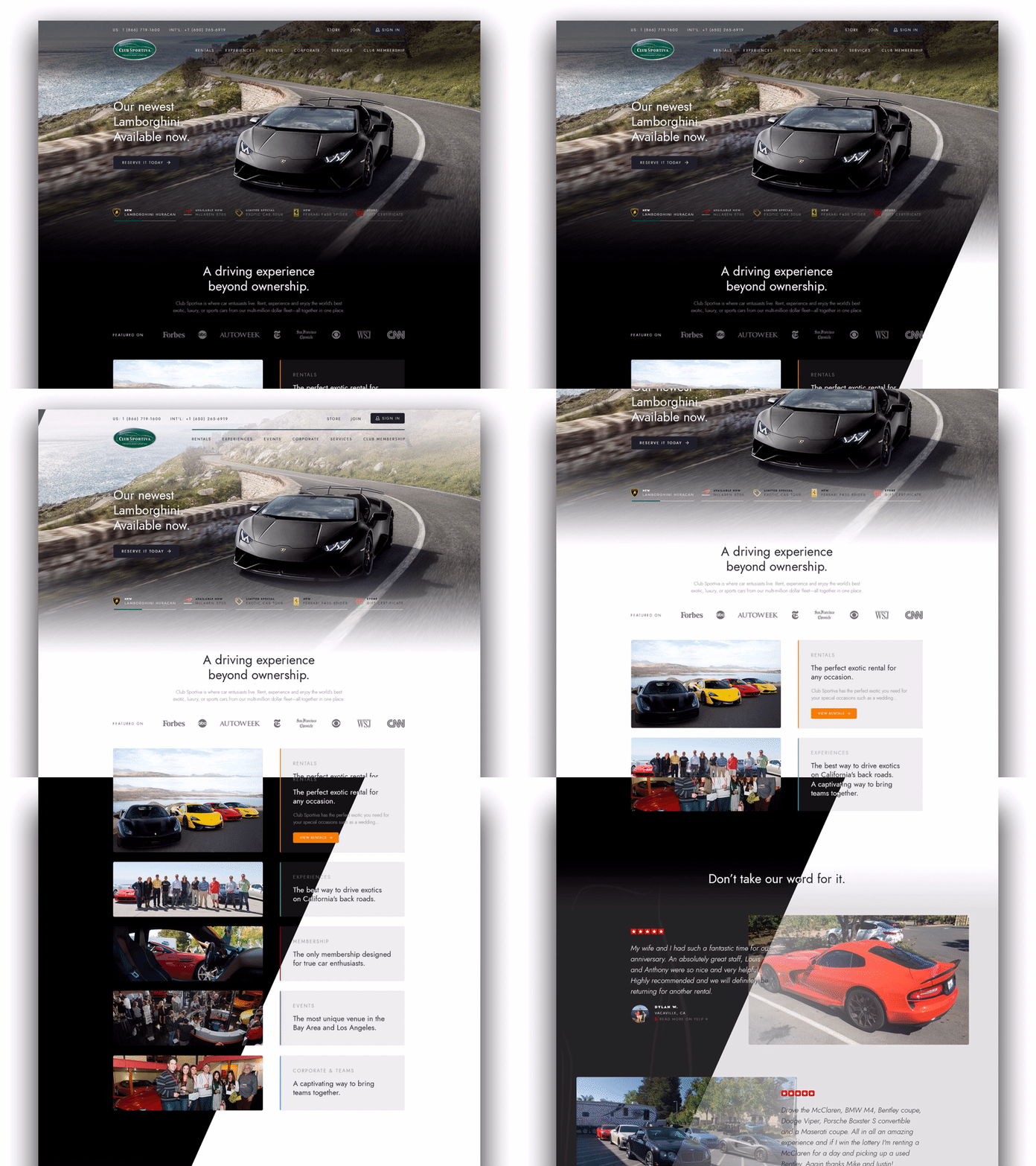
Exotic Car Rental/Experience Homepage — Dark vs. Light
Check out this design concept we created, comparing dark vs. light versions of a new homepage design for Club Sportiva.
Which version do you think expresses "high-end" more?
The animation is cut short due to file size, but you can see the full version here.
More by Allen Djal View profile
Like


