Personal Logo Update
Recently decided to do a personal rebranding.
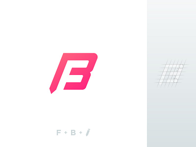
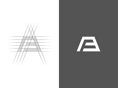
The concept remained the same: letter B + letter F in the negative space, except I included a pencil to the mark and added a colour.
You can see the old logo and compare it with the new one in the attachment. What do you think about the new logo?
Please share in the comments, thanks! :---)
More by Filippo Borghetti View profile
Like


