Dr. Martens Rebrand
I've been doing my best to up my game in branding, web design and motion animation, so I figured a side project was very much called for.
I present to you: my rebrand of Dr. Martens.
As a big fan of my docs, I know the brand is quality, authentic, history-rich and international. I wanted to choose a brand I felt emotionally aligned with in this particular side project, and Dr. Martens was a perfect fit.
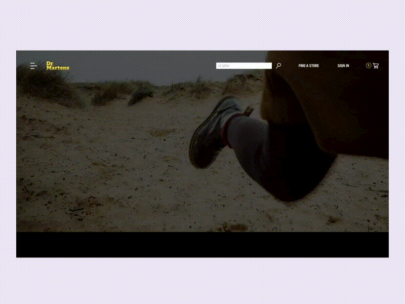
Their current online experience is a little outdated and could use a fresh look. This is what came of my experiments in composition, usability and storytelling. Not only did I re-construct the Doc's homepage, but I also rebranded their identity with a more modern logo while retaining some of the most important and crucial aspects of the widely-recognizable mark.
Crafting the homepage was a lot of fun—I had the opportunity to play around with different ways of showcasing products and creating a layout that is different, yet sleek. It was necessary to create something different for docs, because "different" runs in the veins of their identity and history.
I made sure to keep a punky vibe, but lightened it up with some modern colors and experimental product layouts. What do you think?
Typography: The classic Dr. Martens Trade Gothic + the new look of Akzidenz Grotesk Pro
___ Digital Surgeons | Instagram | Twitter