B2C Eccomerce Account Portal Redesign
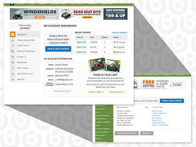
This is an account portal redesign for an eccomerce site. There were some limitations since this is a static site (trust me I gave them all the reasons why they should have a responsive site!). The login page is more appealing and displays the "create an account" section in a way that's more enticing. After the customer logs in, they arrive at the new dashboard where they can find the most important info. The side product navigation was removed and replaced with an account navigation. This allows the customer to always have access to these items, when previously they would always have to go back to the main account landing page to select another item. Definitely a UX improvement. You can see the "before & after" shots.
More by Andrea Zarate View profile
Like


