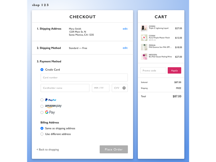
Checkout
Here's my UI page for Day 2 of the Daily UI Challenge!
Knowing that shopping is a multiple step task, my intention behind this simple design is to have the most usable online purchasing experience.
I kept the cart exposed so that shoppers can take one last look before placing their order. Because entering credit card information is a tedious task, payment options are added below for convenience and to speed up the shopping process.
The experiences are inspired by checkout pages from Amazon and Soko Glam.
More by Dyan Lisondra View profile
Like
