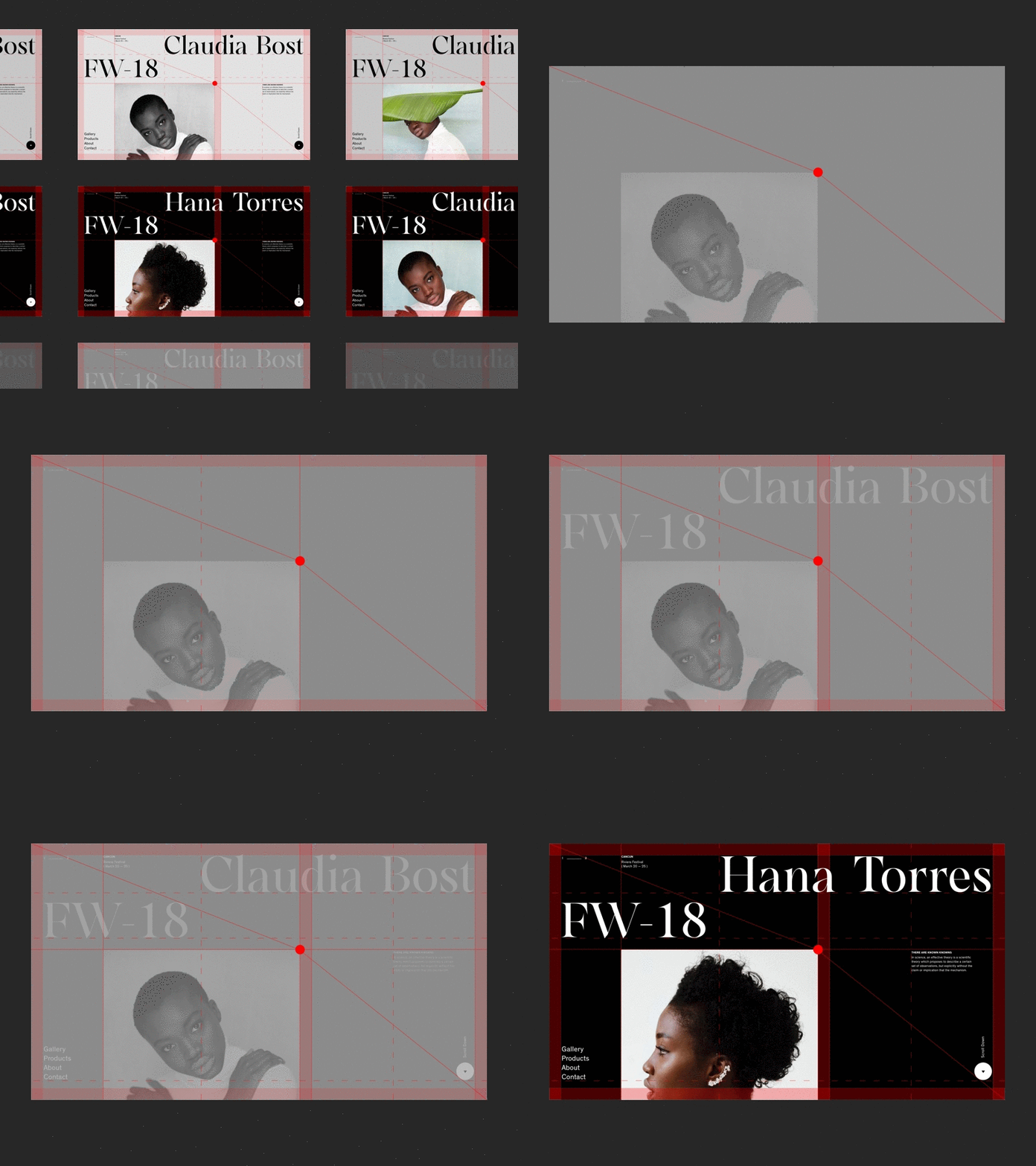
Grid Explained
As I received a couple of questions regarding the way I created this solution, I'll try to explain the entire process step by step.
I used the largest element within the layout to define the grid. In this case, that was a photo. To avoid the classic central composition, I placed the photograph on the canvas in a way that felt natural - I eyeballed it until I found the right spot. In this case, the first step of the design process was to find the right position for the main element, so that I could later create the grid according to it and without any limitations.
I used a red dot to mark the central point - the main focus point of the entire composition. Diagonal lines in this case show the relation between the focus point and the position within the canvas, which is slightly above the area where the diagonal going from the upper left to the lower right edge passes. That's the reason why the diagonal is intersected by the main focus point.
After that, I defined the size of the gutter and proceeded to define the grid with two sections in it. The main section carries the photo, and is in this case more accentuated and wider, while the secondary section is placed on the right and is narrower.
This example shows a step by step process I use to create a layout when I haven't started with a grid, but instead created it based on the main element within the composition.
