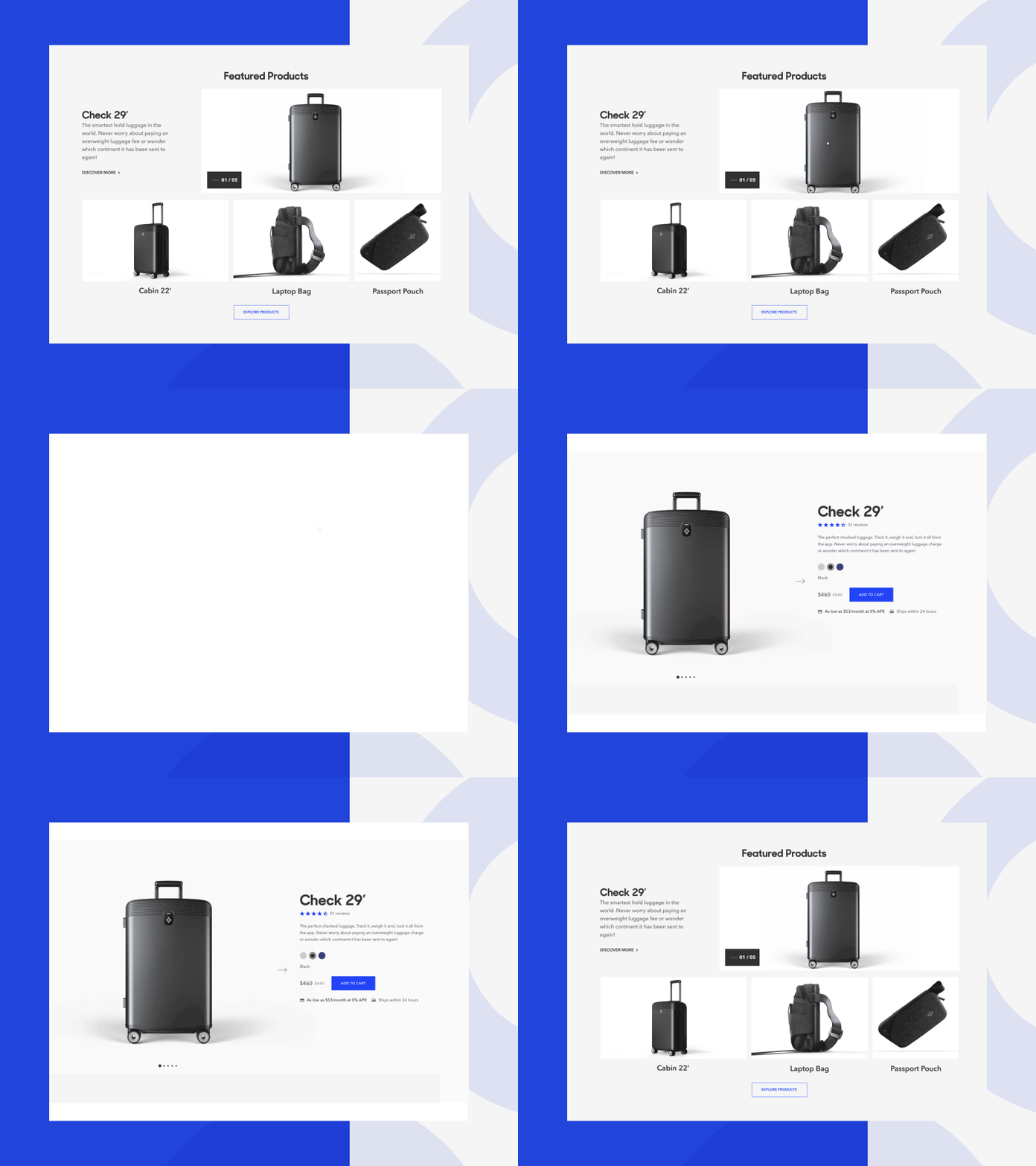
Bluesmart Page-transitions
It's been a while! Today I'm sharing with you pals the last shot from Bluesmart animation. This project was made a year ago with @Sans Bureau team! So, this is the transition between Homepage to Product page detail. The principal idea was, all the images are like a window (4:20 alert!) and when you hover into one of them, the image comes closer to you. If you click, you directly came into the image's world. And the luggage appears with a very smooth change of position simulating the principal natural motion it usually made.
More by Pantufla Cuántica ✺ View profile
Like
