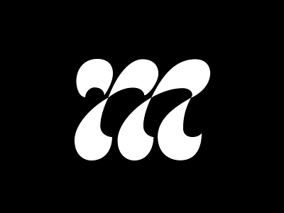
M
Accidental glyph! While redrawing one of ,y older letterings I found that there was an interesting potential in a letter shape. I quickly vectorized it to check if it's so, and I think there's something inside. I'm especially curious about negative space and how it can rhyme with finials of the strokes.
This letter design is inspired by Maria Doreuli's project, you can look it up here:
https://www.behance.net/gallery/38504827/Dutch-Alphabets-lettering
More by Viktoria Stalybka View profile
Like
