Southside Checkout UX
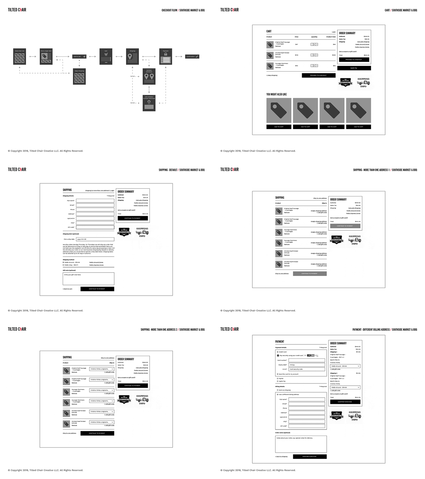
This summer, our oldest client Southside Market & Barbeque asked us to help iron out some hiccups in their checkout experience. There were a number of requirements that complicated things: multi-shipping, address management, and scheduled shipping. Before we even thought about designing the interface, we had to put a good amount of thought and time into the checkout flow, and all the different screens. Laying a well-thought foundation is essential to a successful web project.
If you're hungry, go check out the site for yourself. Pro tip: keep a napkin or kerchief handy, it's a darn tasty website.
Follow Tilted, it's worth it.
Instagram | Facebook | Twitter
More by Tilted Chair View profile
Like


