Brighte Homeowner App
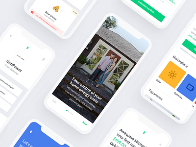
Taking a few key components from the unfinished Brighte styleguide like the key primary colours and the swirls, we crafted a brand new colour palette that would give Brighte the flexibility and simplicity of producing content that really vibed with the new brand. We chose colours that were bold and vibrant, but still approachable by homeowners. Overall, the goal was to make the app feel a little bit... brighter.