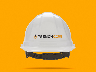
Brand Identity Design for Construction Company
Brand identity design for a construction company. The client wanted a minimalistic and distinctive logo design that incorporated a shovel. The shovel symbol was created using their initials T and C. The typeface was modified in various ways for a more custom design. One of the modifications includes the reshaping of the letter C so that it matches the C used in the symbol.
More by Aesphi View profile
Like


