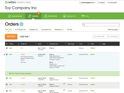
Ordoro List Page
Still hammering out all the details, but this is the 95% complete new UI for our main list pages. We moved from a 2 column layout to single and are now allowing users to expand the table rows to get more info about their orders, products, etc without having to leave the list page.
Our hopes are that this sets the stage for our next big project: a revised batch processing workflow.
Full-size image attached.
More by Matt Omohundro View profile
Like

