Use Capitals Without Being Shouty
Don't be afraid of using all caps on a text field because it seems too shouty and loud. Caps may sometimes be exactly what a CTA, label or metadata should be displayed in.
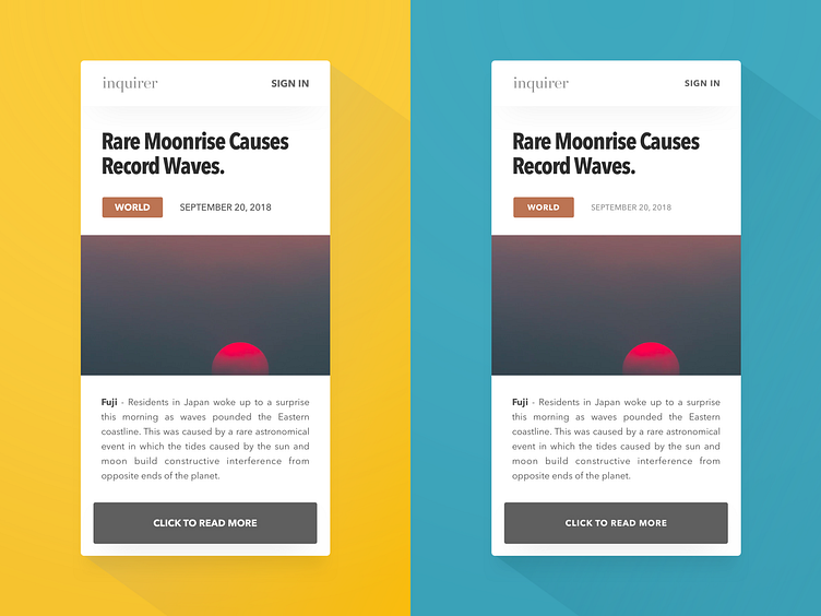
How do I correct loud text when using all caps? 1. Drop the font size by 2 or 3 points; this corrects the optical illusion that the caps text is bigger or shouty 2. Increase letter spacing; this is critical to relaxing how the reader perceives the text 3. Optionally, use a lighter font weight or make the text lighter (I like decreasing opacity)
The difference it makes is huge when you compare the left, shouty screen (all text is 18pt), and the right side in which the capitals are much more tame (all caps text is 15 or 16pt).
Photo credit: João Barbosa on Unsplash
