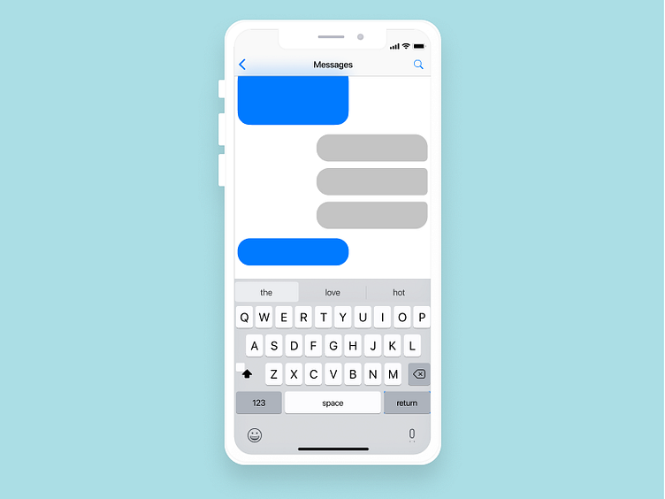
Daily UI#013 - Direct Message
This was my first time trying to design an iPhone interface. It ended up taking too much time than I anticipated to learn and apply. I was doing some research and also found that some messaging platforms have very subtle differences of corners of messages.
I also realized that I need to take more advantage of shadows. No wonder my designs looked so flat!!
More by Andy Park View profile
Like
