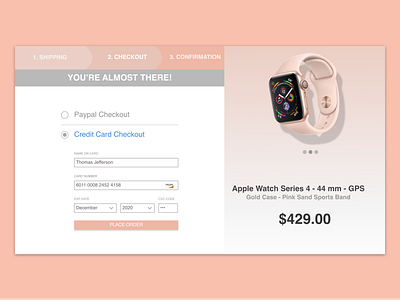
Credit Card Checkout - Daily UI (Day 2)
As part of the Daily UI program, day 2 tasks you with designing a credit card checkout page.
My first thoughts were how do I make the page simple, yet aesthetically pleasing? As you want what is arguably one of, if not the most important page on your site to attract the customer into clicking the "buy" or "place order" button.
This simple credit card checkout page taught me just how much your design changes as you work on it. Whether its the colors, the font sizes, or how information is displayed, it morphed into something that I am proud of. I look forward to day 2 in the Daily UI program, as I hope to continue to grow my skills and knowledge.
If anyone has any suggestions or tips, feel free to drop some comments my way!
Thank you for looking, as well as sharing your thoughts and opinions,
Jordan
