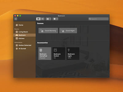
macOS Home Native App
Personally not a fan of the current Home app in Mojave so I made a mockup of what a native Home app might look like.
One of the things I changed was how to "Active" state of buttons look. On iOS, when a light is off, the button appears to be dimmed and when it's on, the button turns white. But to make the app feel more native, I did the opposite of that to make "Active" state feels pressed. There's just something wrong about clicking a button and it pops up instead of being pressed down.
I’m currently available for your upcoming project. Get in touch: hello@pwign.com
More by Anh Nguyen View profile
Like
