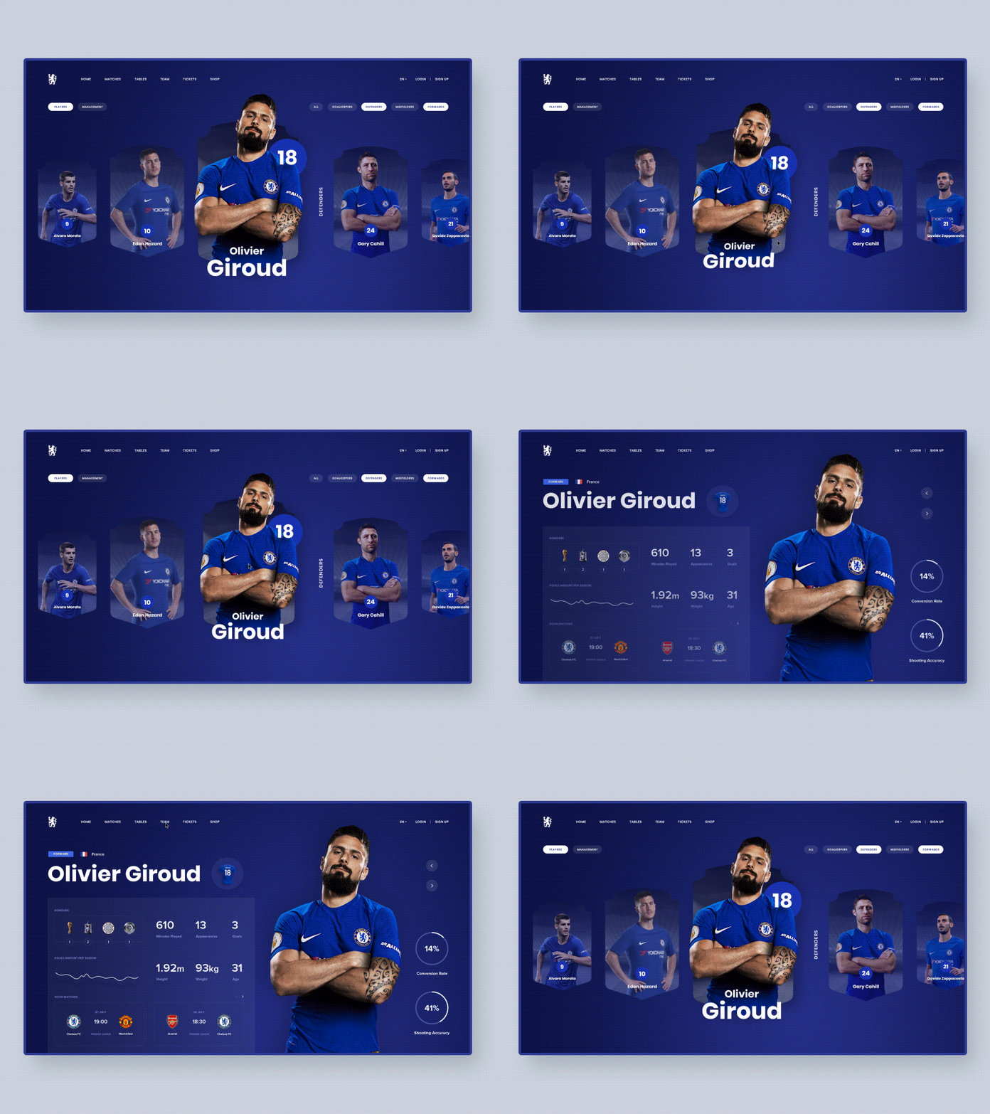
Chelsea FC. UI redesign & animation concept
Have you ever noticed that many great and well-known websites have so outdated design? We, UX ENERGY, decided to suggest the ideas of how some of these websites would look in 2019.
🔥 You can check the full Behance case here:
https://www.behance.net/gallery/70036407/Famous-Brands-UI-Redesign-Interactions
Today I want to show you a Chelsea FC UI redesign & animations concept!
Please just look at Chelsea F.C. website. Right now. Scroll the page to the footer. And look through our concept. I’m sure, you think too that such a cool football club needs the website redesign. So this is how it could look like.
Chelsea F.C. became Great Britain’s champion six times, won the Cup of the Football Association eight times and the Cup of the Football League five times It’s awesome!
The real winner’s website should exude strengths and confidence, be dynamic. As football is drive, emotions, expression.


