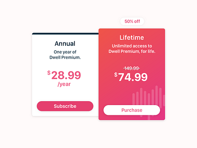
Dwell Pricing Page
I've always found it difficult to design a compelling pricing page — something about the data being so structured makes it hard to break out of the "generic boxes of uniform content" mindset.
We're tweaking the Dwell pricing page to focus on just two plans, so I decided to try giving each of them a different (though complementary) style.
The Annual panel uses a style common across the rest of the site.
The Lifetime panel uses our brand gradient, along with a transparent version of the Dwell logo in the corner. I wanted to make it feel really premium, to match the offering.
These are still a work-in-progress, but you can check out everything we're doing at Dwell right here:
More by Jordan Koschei View profile
Like
