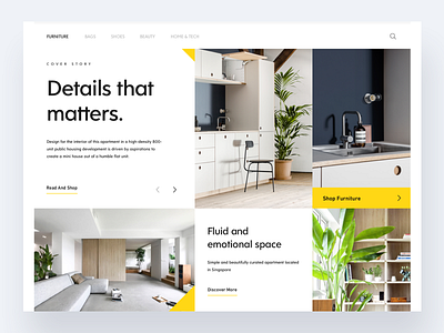
Architecture UI Shot
Hey Dribbblers 🏀🔥
Hope you all had a great summer time! I know it's gone, that's why I wanted to get back to work on more concept design as days get shorter and colder.
Today I'm sharing with you a content rearrangement of a real project I'm working on (soon I'll be sharing some stuff).
The goal here is falling in love with grid style design... no, I'm joking. The idea is just having some fun with a magazine-like styled layout, with images composing a full-screen grid and showing article contents taking advantage of white space between them. I played also with a collapsed button style.
That's all for today.
Check the full resolution 100% in the attachment.
Don't hesitate to share your feedback!
Press L to show some love 🔥❤️
Cheers!
More by Andrea Montini View profile
Like

