Segment Catalog Search
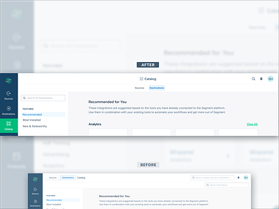
The addition of our new global search to the navigation (top right) prompted the need to reconcile existing search capabilities in the Catalog section of Segment’s app. To solve this (while also accounting for @Jeroen Ransijn's upcoming UI update on the top navigation), I:
• Centered the toggle between Sources and Destinations Catalogs beneath “Catalog” (improved information hierarchy - placing the subitems under the item)
• Relocated the Sources/Destinations search bar to the left sidebar, since the latter already filters Sources and Destinations (improved information hierarchy - clustering functionally-related items in closer proximity)
• Minimized the global search icon, which now expands on click (reduced visual clutter)
More by Segment View profile
Like

