Sqdc
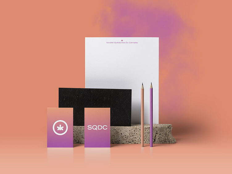
My take on the SQDC logo (https://www.emploicannabisquebec.ca/) The exercise was to re-work the symbol to make it look less like a cat's but and develop the brand a bit more.
Complete exercise here : https://blog.usejournal.com/redesigning-the-future-image-of-cannabis-in-qu%C3%A9bec-875ca3fb7d42