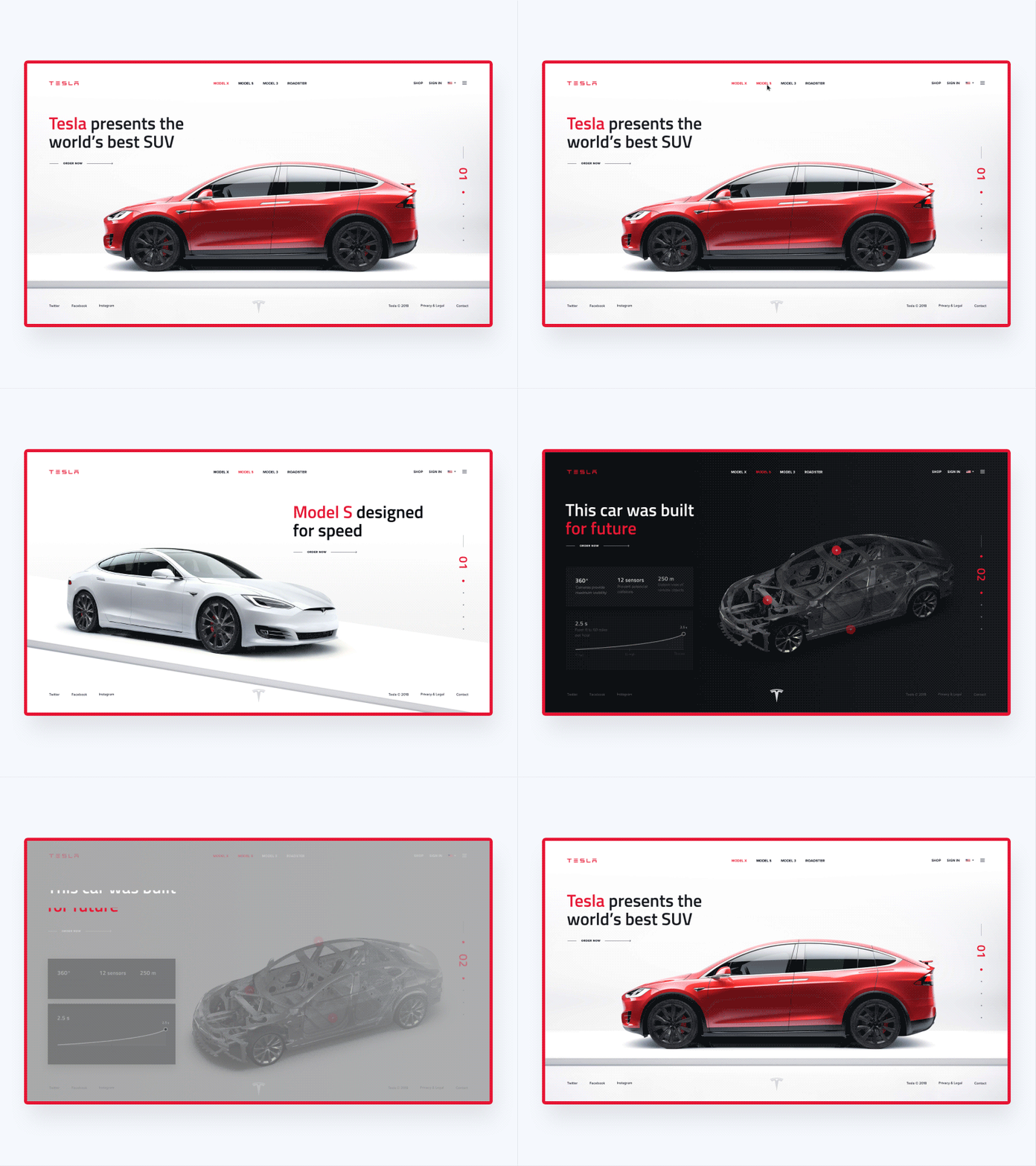
Tesla. UI redesign & animation concept
Have you ever noticed that many great and well-known websites have so outdated design? We, UX ENERGY, decided to suggest the ideas of how some of these websites would look in 2019.
🔥 You can check the full behance case here: https://www.behance.net/gallery/70036407/Famous-Brands-UI-Redesign-Interactions
Today I want to show you a Tesla UI redesign & animations concept!
The Tesla cars are perfect inside and out. The current Tesla website is nice, dynamic and professional. We just improved the typography, made the cleaner composition and added color accents. So this is how the website can become minimalistic, solemn and restrained, but it doesn’t lose its premium feel.
More by Nick Zaitsev View profile
Like


