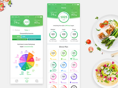
Home Screen
Hey,Dribbblers!
Just add some home screens.
It is one screen but it presented it in two, because it is very long. When the user scrolls the app content, the circle hides in the top bar.
The idea of this screen is to show the user nutrition plan. User complete the quantity of food he ate in to different categories. Diagrams inform him how close he is to his food limits.
If you like this shot, press L :)
I appreciate it
More by Barbara Kalinka View profile
Like


