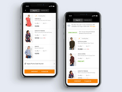
Jabong Cart Redesign
Hello Guys,
Jabong's cart redesign is now live on both platform iOS and Android. We are currently amidst doing a major redesign of our Jabong app. More to come soon.
What we have improved in this redesign?
- Improved the information architecture flow. In previous design, it was very hard to understand the flow as price was on right side and other information was on left side. Sometime it becomes hard to scan the information and make decision.
- Increased the size of Product Image thumbnails to clear visibility of the product.
- A clear segregation between non-combo product and combo products. Previously, it was all combined within a card view.
- Proceed to checkout button is in first fold which will be very helpful for users who love instant checkout.
- Visibility of final amount in first fold.
- Users can see applicable offers in first fold which will help users to make the decision-process easier and faster.
______________________
Let me know what you guys think? Any feedback is welcome!
Do checkout the attachment here
Get more updates here
Instagram

