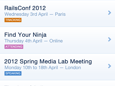
Your Events iphone listing
As part of the design refresh of our iphone app, this is the listing view for events you are interested in.
Rather than just have three lines of text with one saying 'you are tracking this event' I killed all the unnecessary words and changed the indicator to have a colour that has the same meaning on the website (for example in the schedule grid view).
The feint gradient is meant to make the rows feel more clickable. I have changed the chevron and the separator lines to blue. Text colour and spacing have changed quite significantly from the previous version too.
More by Natalie Downe View profile
Like
