Categories
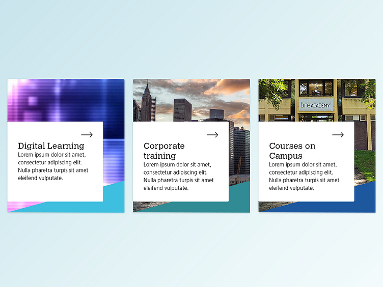
Working on a new visual, some of the feedback I received included the use of imagery rather than icons. Here is what I proposed.
The idea is that the colours in the bottom right will represent the area that the user is in.
More by Shahid View profile
Like
