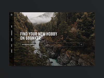
6Bunker Homepage
This is the homepage for 6Bunker. The client wanted something clean and simple, and I wanted to play around with a left hand nav. I found having the nav on that side gives the main image more room to breathe and really puts the emphasis on the search box, which is where we want to funnel the visitors
More by Todd Cantley View profile
Like
